Wednesday, March 18, 2015

Microsoft… Image Composite Editor

Microsoft recently released an updated version of their free application for creating panoramic images. Although Adobe and others have included panoramic stitching in their programs (like Photoshop) Microsoft Image Composite Editor includes some enhancements that make producing compelling images even easier. This paragraph (below) from their website describes the application nicely.

Image Composite Editor (ICE) is an advanced panoramic image stitcher created by the Microsoft Research Computational Photography Group. Given a set of overlapping photographs of a scene shot from a single camera location, the application creates a high-resolution panorama that seamlessly combines the original images.

I have tried for years to get a photographic image of the stained glass window and front wall of the Gethsemane Lutheran Church sanctuary that captures the simple elegance of the space. Standing close to the front with a wide angle lens never quite does it justice… and photos shot from far back are cluttered with details that detract from the beauty of the stained glass, altar, and banners. Stitching together a bunch of photos shot from the first row of pews creates a pleasing perspective of this difficult to capture space.

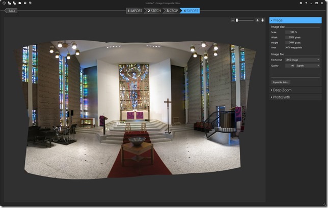
The screen shot below shows the Image Composite Editor (ICE) interface with photos from my Canon G15 loaded. I set the zoom lens to 6.1 (28mm) and captured four rows of five photos that include all the elements I want in the finished image. Standing at the center of the church (very close to the baptismal font) and carefully pivoting the camera across the scene while shooting the photos allows me to capture the entire front wall in 20 images. In this case having five photos in each row ensures that the center photos are aligned to the center of the scene. Although I almost always shoot the photos in “sequence” the ICE application seems to be able to sort out photos shot in any order.

ICE (cameras)

Selecting the “next” command causes the program automatically stitch the selected photos together into composite panoramic image. The feature that really sets ICE apart from tools like Adobe’s Photomerge is that we can preview the composite image in 10 different projections before committing to one. As a matter of fact we can save the imported stitch as a “project” file returning to switch to a different projection at any time. The screenshot below shows the sanctuary composite image as a “Spherical” projection…

ICE 2

this second screen shot shows the “Perspective” projection…

ICE 3

the third a “Transverse Spherical” projection…

ICE 4

After choosing a projection the composite image can be cropped and saved. I this case I chose the Spherical projection and did not crop the image using the ICE program.

ICE 5

Exporting the resulting composite image to disk at the highest quality setting resulted in a 9MB file with pixel dimensions of 8893 x 5410.

ICE 6

Opening the composite image in Photoshop (Elements 13 here) allows us to crop and enhance it…

Sanctuary 3

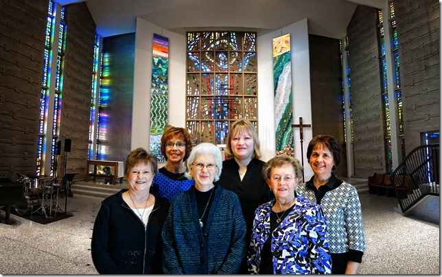
Eventually creating this creating this finished image that I think captures the elegant beauty of this space in a way… and from a perspective… that no single image from the camera can. It’s easy to imaging that one or more of the other possible projections available might produce an equally pleasing view of this space.

Gethsemane Sanctuary (de sat)

And (of course)… We can now start “compositing” all sorts of other things into the image we create!

Gethsemane Sanctuary Ladies (Wren)

Tuesday, March 10, 2015

Group Photos

I’m often asked to capture group shots at Church and have settled on a location and process that works pretty well. The image below shows the fifth grade Sunday School class with their families on First Communion Sunday. I started using the East wall of the fireside gallery because it is long enough for pretty much any group and there is more than enough light available. I think the artwork and gallery hanging system on the wall behind the group adds a nice touch to the image. There are (of course) a few tricks to making this work well.

_DM32216(5)

Positioning the first row of people 8 feet from the wall provides “depth” allowing you to blur the framed artwork on the wall (ever so slightly) in the finished image. This depth is much more apparent in the shot of the girls below. The blinds in the windows along the South wall help control the light streaming in during daytime hours.

_DM32188(small notes)

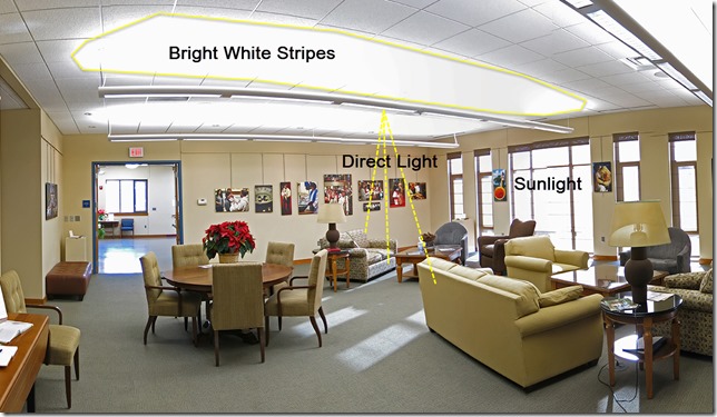
The overhead light fixtures in the fireside gallery are particularly nice because they not only project light directly down but also create a bright strip of light on the white ceiling tiles above. This reflected light “bounces” all around underneath the fixtures creating a very nice “soft” light source.  Combining the different light sources together provides not only an abundance of light but also the opportunity to create different “looks” depending on the position of your subject.

Gallery Lighting (small notes)

All of these elements make the actual South-East corner itself a nice spot for an “available Light” Portrait.

A26U1389 (NIK)

Positioning your subjects well off the background is always a good idea regardless of the venue. The separation of subjects from backgrounds is an easy way to make your photos “stand out”.

Group Shot (vin)

Wednesday, February 25, 2015

Theater Photography

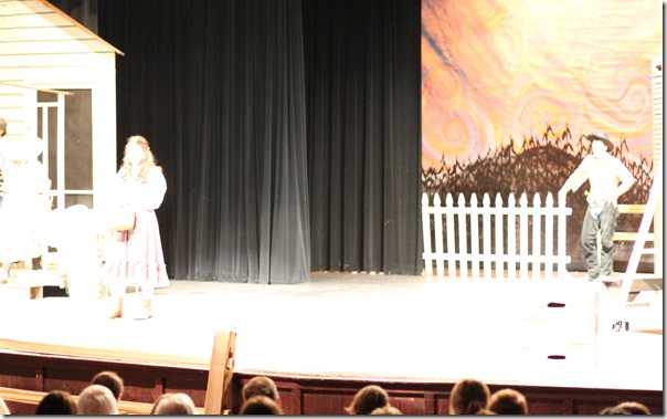
The problems faced in theaters are the brightly lit faces against dark backgrounds and the desire to use telephoto focal lengths. To get a nicely exposed image you will need to change to a few settings on the camera. I generally shoot theater photos using...

  • Shutter Priority at 1/125 second
  • Highest ISO possible (1600 using the 5Ti)
  • Spot Metering Mode
  • Center Point Focus
  • Single Shot Shooting Mode

And… a single shot mentality while shooting the photos.

  • Point the camera at the subject
  • Frame with your zoom a little beyond what you want in a final image
  • Put the center spot on the subject's face (brightest spot possible)
  • Release the shutter fully after each shot

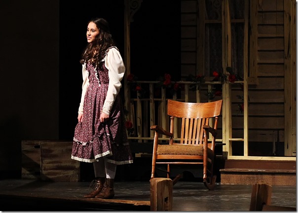
This shot of Jane shows the technique nicely. Her dress is the brightest thing in the viewfinder and conveniently right in the center of the image we want.

viewfinder 3

A26U8844(2)

Many times we will have this instead...  My finished image is a cropped section of the original capture where I had the center spot on the bright part of the shirt.

viewfinder 2

A26U0963(2)

Leaving the camera in "full automatic" usually gets you images where the black backdrop is exposed "correctly" and the faces are completely blown out. like this...

A26U1037

Configuring your camera to display any blown-out highlights and paying attention to the histogram on the built-in LCD display allows you a way to quickly and easily ensure the images you capture will be exposed properly. Blown-out highlights will “blink” on the LCD display when the highlight alert function is turned on. usually looking something like the animated images below.

Highlight_Alert     anim_revblink

Any part of the image that is blinking will be completely blown-out (you never want to see the actors faces blinking). You will also want to have some “information” (spikes) in the fifth “bin” of the histogram. It is important to note that the “blinking” highlight alerts are a much better indicator of over exposure. A scene with very few highlights can be very hard to analyze using only the histogram on the LCD. Pretty much any blown out pixels will blink obviously.

So… If nothing you want in the image is blinking and there is some stuff in the last bin you are good to go!
histogram-step-2

In the real world it is sometimes not as quite as “cut and dry” as the example above. The image I used earlier provides a good example of what I saw on the back of my camera when shooting this High School Play. Here the highlights (bright stuff) shows up more like a line across the bottom of the histogram that does not quite reach into the fifth “bin”. But I knew I was in good shape because there was nothing blinking in the image and the highlights were at least most of the way across the fourth.

A26U0963 (example 2)

Another perfectly reasonable approach is to set the camera in full manual mode. The example image here was captured with the shutter set to 1/500 sec; The aperture at f/4.0; and the film speed at 3200 ISO. After determining the exposure settings using the methods described earlier you could switch to full manual and shoot without changing anything between shots. Full Manual works really well in a setting where the lighting remains constant. In the example here you will get a nicely exposed image as long as her face remains in the lights.

Manual Exposure

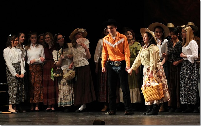
Unfortunately we are usually faced with something more like the scene below where some of the faces are in the lights and some in the shadows. Here you would use slightly different settings to correctly expose the faces of the kids holding hands than the settings for the girls on either side. Setting the camera to one of it’s automatic exposure modes (P, TV, AV,) as described earlier allows one or more of the exposure values to change automatically as the center spot sees more or less light. This uneven lighting is what makes images shot at school plays so beautiful. Getting the exposure right is actually pretty easy even with a moderately priced camera, and the results are fun!

A26U0979(3)

Friday, February 6, 2015

Bay Photo Calendars

Every year between New Years and Groundhogs Day (Feb 2nd) Bay Photo offers their very nice calendars at a 40% discount. This year I decided to produce a 2015 –2016 bird photography calendar featuring birds in and around our Minnetonka neighborhood. While they only offer four different calendar types the quality of their products is superb. 

Bay Photo website

Bay Photo uses the ROES (Remote Order Entry System) from Soft Works. ROES is a JAVA based application that offers a remote user the ability to precisely select crops and rotations of their images within products. The ROES interface loads quickly and works well. Building a calendar is as easy as up-loading a folder of images and then dragging and dropping them on the template. Bay allows you to start your calendar on any month. The finished calendar is then ordered from right inside the ROES system. My calendar starts with March 2015 and ends with February 2016 (they will be sold as a part of fundraiser for Gethsemane Lutheran Church… on Feb 21st).

Bay Calendars

You can download a nice “rendered” version of the individual pages after the calendar is finished. I’ve used these images to produce the promotional page here. The actual calendars are beautifully printed on nice heavy paper stock and look fantastic. A link to a Smugmug album containing the images below…

http://jwpictures.smugmug.com/Wildlife/Bird-Calendar/

Promo Doc

Thursday, February 5, 2015

Photography Club (2015)

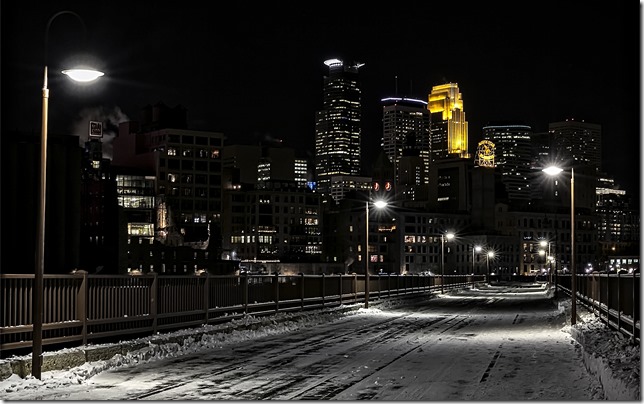
The Gethsemane Lutheran Church Photography Small Group met the last four Fridays of January. We decided to split the time in half having two photography field trips and two in-house sessions. The field trips to the Stone Arch Bridge in Minneapolis (Jan 10) and Ice Carvings at Rice Park in Saint Paul (Jan 31) each provided wonderful photo opportunities.

Minus 3° F temperatures and swirling winds did not stop our intrepid group from venturing out on the bridge…

_DM30185(2)

The pitch black skies and snowy bridge deck add to the “wintery feel” of this nice image of the downtown Minneapolis skyline shot from the middle of the bridge over the Mississippi River.

5DM30183(4)

Rice Park is the venue for an ice sculpture contest held each year during the Saint Paul Winter Carnival. A week of warm weather melted most of the ice but Rice Park always yields good opportunities for photography. This image captured in front of the Ordway Theatre shows off the night time beauty of the park nicely.

_DM30694(2)

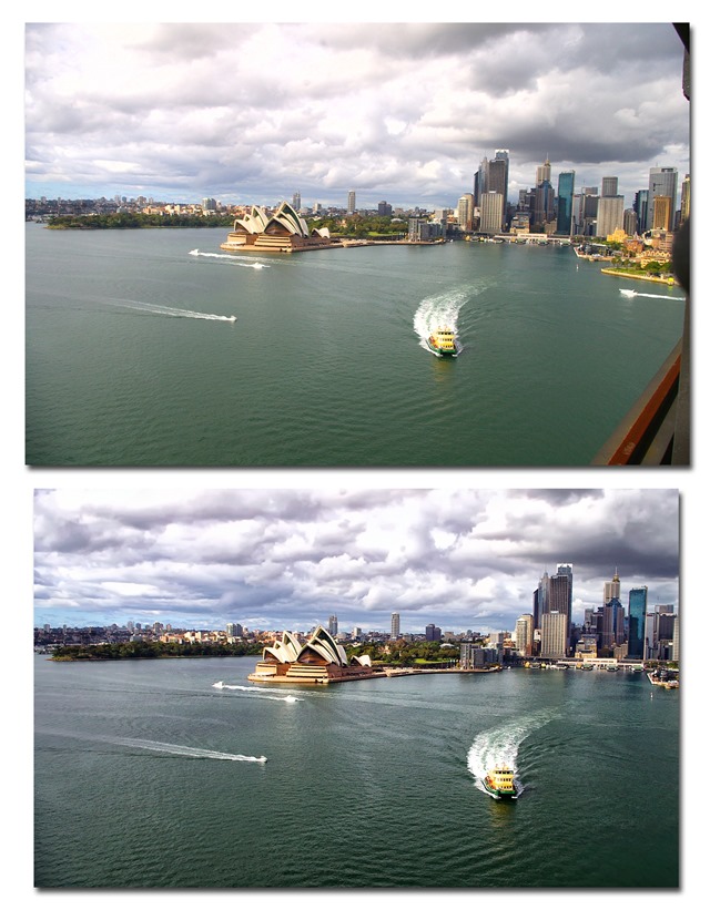
The two images below show the Stone Arch Bridge photo before and after “enhancing” using Adobe Photoshop Elements. Cropping, straightening, tweaking exposure, and toning transforms this “as shot” photo into a beautifully pleasing image.

Stone Arch (B and A notes)

My favorite image from our field trips nicely re-enforces a point I’ve heard often in photography classes… Don’t put your camera away too soon! I captured this image of the downtown Saint Paul Light Rail Central Station as we walked away after photographing in the park. Continuing to shoot photos all the way back to the car brought me to this really nice place.

_DM30756(2)

Thursday, June 5, 2014

Hidden Gems…

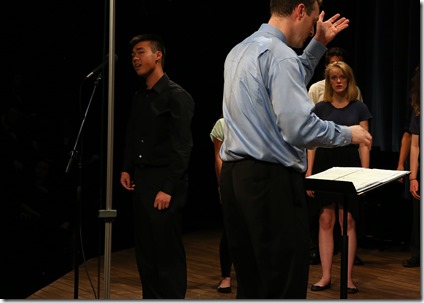
Becoming proficient in Photoshop opens up all sorts of possibilities. This nice portrait of our friend Kevin Li is great example of a good image hiding in a so-so photograph. Taking the shot using spot meter provided just enough exposure on his face while leaving the background black. Framing the shot in the viewfinder so that the microphone boom is off his body makes the editing simple and easy.

4G3A6244(2)

Before (above)… After (below)

4G3A6244(Justin NB)

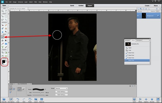
To accomplish this task is Photoshop Elements you simply crop close around the subject.

Hidden Gem 2

Then paint out the elements you don’t want in the final image using a paintbrush set to black.

Hidden Gem 3

Monday, March 17, 2014

Photography Club…

Gethsemane Lutheran Church in Hopkins sponsored a small group ministry initiative this winter that included a photography club. Dave Johnson and I volunteered to lead the group that met for six weeks in January and February. The group decided to concentrate on learning how to use our digital cameras and editing software in the time we had together. We spent a lot of time discussing camera settings and shooting techniques as well as talking about different approaches to “enhancing” images using Photoshop.

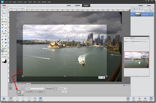
In the example below we took one of Earl Rodine’s very nice photographs of the Sydney Australia harbor and played around with crop ratios and image enhancements. The screen shot below shows the original image with the “Golden Ratio” crop tool selected. This is an image that I think benefits from this sort of crop. The ferry boat in the foreground makes a nice focal point and the opera house ends up on the strong diagonal across the image.

Golden Ratio Crop

Digging a bunch of details out of the sky and water using the NIK Software plugin for Photoshop Elements 12 produced the nice image at the bottom. It is fun to see folks become aware of all the artistic possibilities available using Photoshop. I Hopefully Dave and I inspired a few others to dive in a little deeper!

Golden Mean